
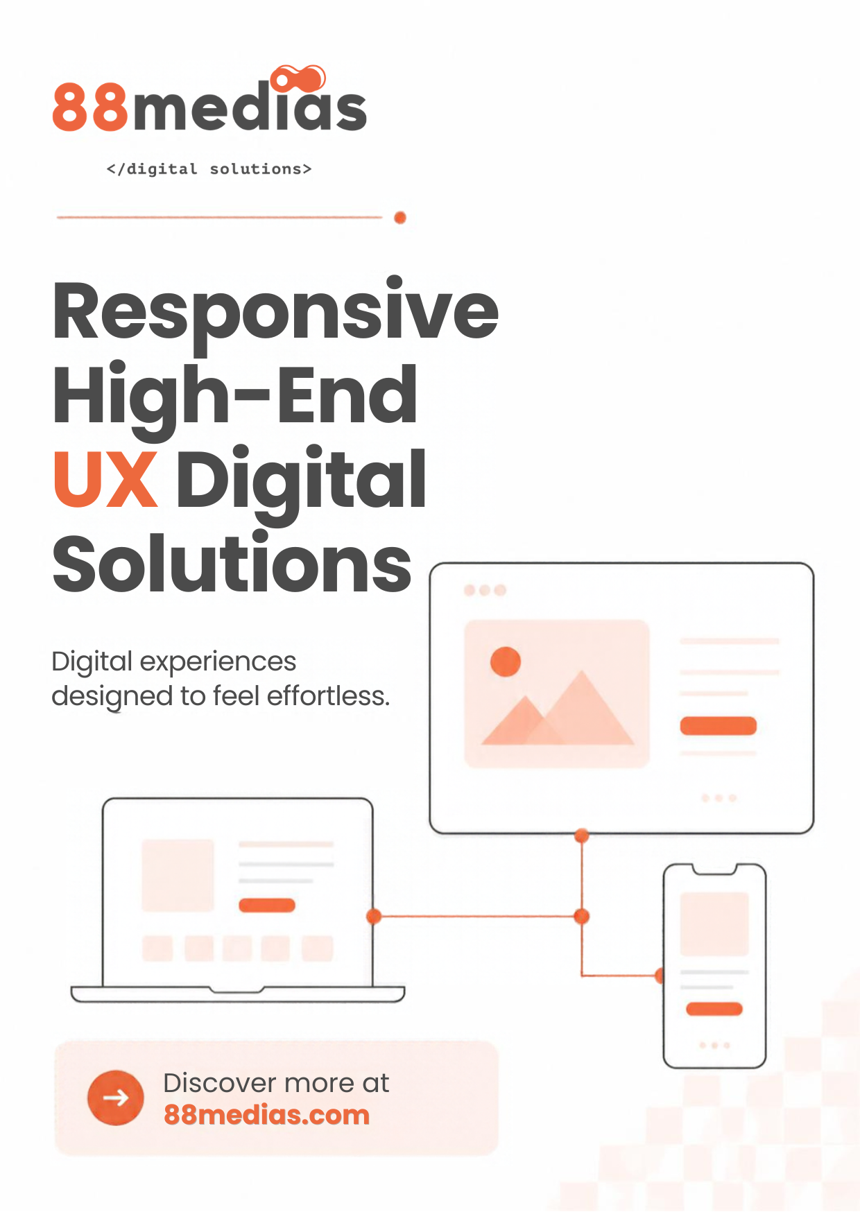
Your customers don’t use one device. They discover you on their phone during a commute, compare options on a laptop at work, and come back on a desktop to buy. If your website feels great on one screen and clumsy on another, you lose them somewhere along the way.
That’s why responsive, high-end UX sits at the core of everything we build at 88medias.
Responsive is more than resizing
Many sites call themselves responsive because their layout shrinks to fit a phone. But squeezing a desktop page onto a small screen isn’t the same as designing for it.
True responsive design asks a different question for each screen: what does this person need right now, and how do they want to get it?
- On mobile, that means thumb-friendly buttons, short forms and the most important action within easy reach.
- On tablets and laptops, it means layouts that use extra space to show more context without clutter.
- On large desktops, it means rich visuals and detail, while keeping the page easy to scan.
The content and the brand stay consistent. The experience adapts.
What makes UX “high-end”
High-end UX isn’t about flashy effects. It’s about removing every small moment of friction until the experience feels effortless. In our projects, that comes down to a few principles:
- Speed first. Every extra second of loading time costs attention. We optimize images, code and hosting so pages appear fast on any connection.
- Clear hierarchy. Visitors should know where to look and what to do next within seconds.
- Consistency. Buttons, colors and patterns behave the same way everywhere, so users never have to relearn your site.
- Accessibility. Good contrast, readable type and keyboard-friendly navigation make your site usable for everyone.
- Polish. Smooth transitions and thoughtful micro-interactions make the experience feel cared for.
Why it matters for your business
A seamless experience across devices isn’t just nice to have. It affects how long people stay, how much they trust you, and whether they take the next step. When customers can move from phone to laptop without friction, they’re far more likely to come back and finish what they started.
It also helps you be found. Search engines favor sites that load quickly and work well on mobile, so a strong responsive build supports your visibility as well as your conversions.
How we work
Every responsive project at 88medias starts with your users and the devices they actually use. We map the key journeys, design for the smallest screen first, then scale the experience up. Before launch, we test on real devices, not just simulators, so what we ship is what your customers see.
Ready for a website that feels effortless on every screen? Discover what we can build together.