A logo has a few seconds to say who you are. A symbol has even less: often just a small square on a phone screen. So when we designed the new 88medias icon, we wanted a mark that would be recognized instantly and still carry meaning when you take a closer look.
Here’s the story behind it.
Reading the mark
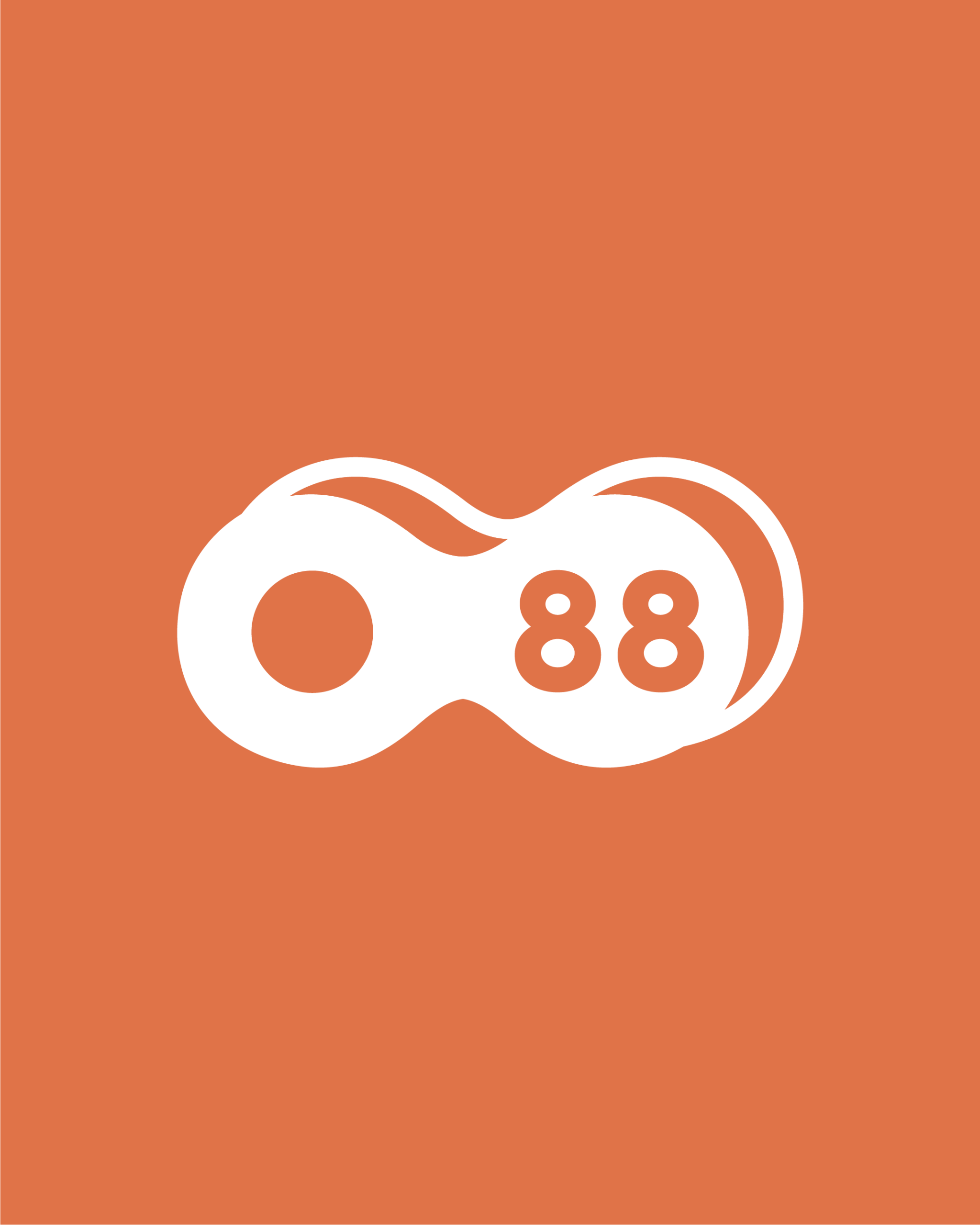
At first glance, the symbol is a single bold shape. Look again and three ideas appear.
An 8 turned on its side. Rotate an 8 and you get the infinity sign. For us, it stands for work that doesn’t end at launch: ongoing improvement, support and growth.
A link between two parts. The shape reads as two loops joined in the middle, like a link in a chain. One side is our clients’ business, the other is our team. The connection between them is where the real work happens.
The 88 at its heart. Our name sits inside the shape, so the symbol always carries who we are, even when it appears without the wordmark.
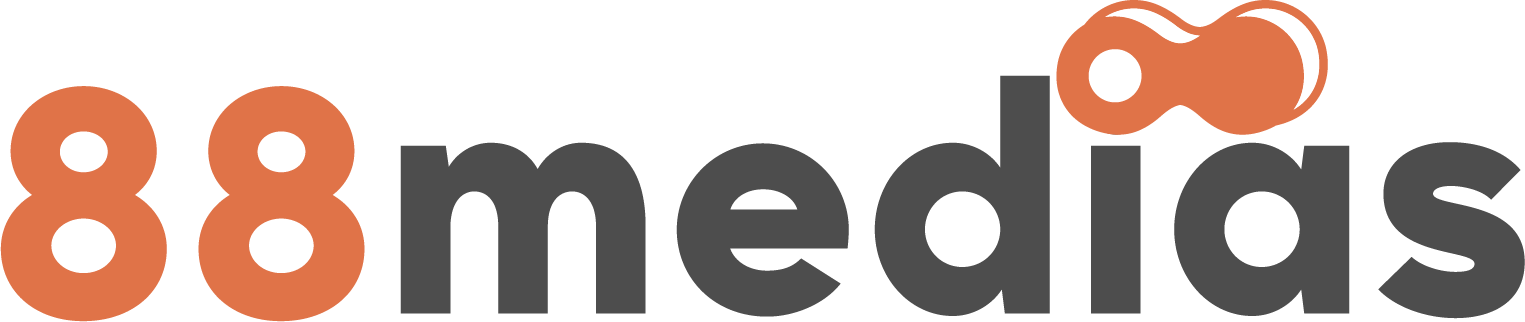
The same shape also crowns the “i” in our wordmark, tying the icon and the name into one system.
Built to work everywhere
A digital agency’s logo lives in more places than most. We designed the symbol to hold up in all of them:
- Small sizes. Solid, rounded forms stay clear as a favicon, an app icon or a profile picture.
- Any background. It works in white on orange, orange on charcoal, or charcoal on blush without losing its shape.
- Motion. The two loops give us a natural starting point for animations, transitions and loading states.
Good design is invisible when it works. A good symbol should be the same: always recognizable, never in the way.
A promise in a shape
In the end, our symbol is a reminder of how we want to work with every client: connected, committed and in it for the long run. When you see it, we hope you’ll think of a partner that stays with you well beyond launch day.
Want to build something lasting together? Let’s talk.